Each logo for the amazing RPG series Final Fantasy is done by artist Yoshitaka Amano, who even redid the logos for the first three games after they were re-released. FF logos are made early in production and based on minimal information; they're usually done before much of the character designs are even finished. The art is his interpretation and centers around the theme of the game in most cases.
Final Fantasy
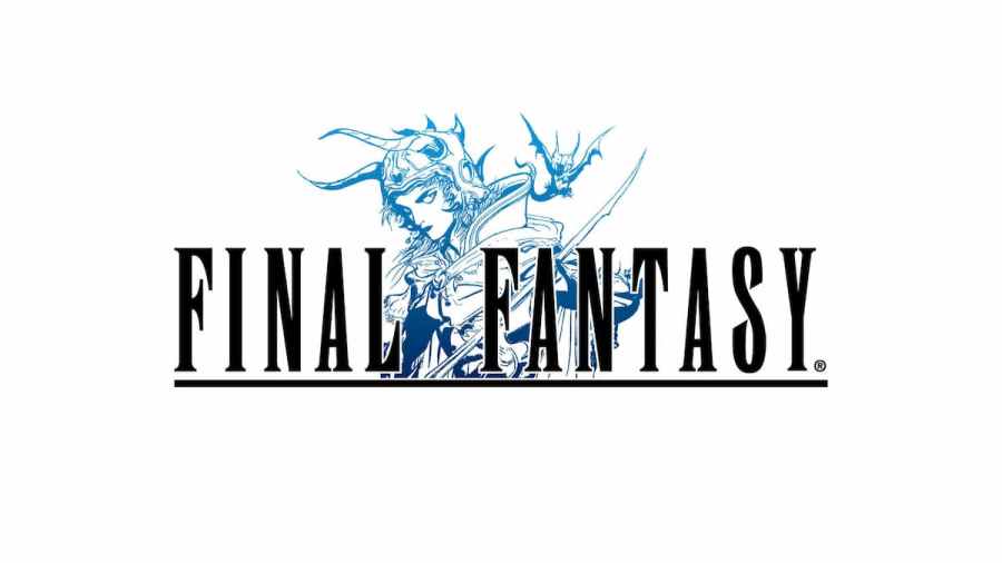
The first logo for the NES title was a simple blue design of katakana in Japan with dark-red lettering in the West. For the re-release of the game Final Fantasy Origins, however, Amano's design centered around the Warrior of Light in blue, reflecting the original Japanese design. It was changed once again in 2007, putting him in a different pose for the 20th-Anniversary version of the game on PSP.

Final Fantasy II
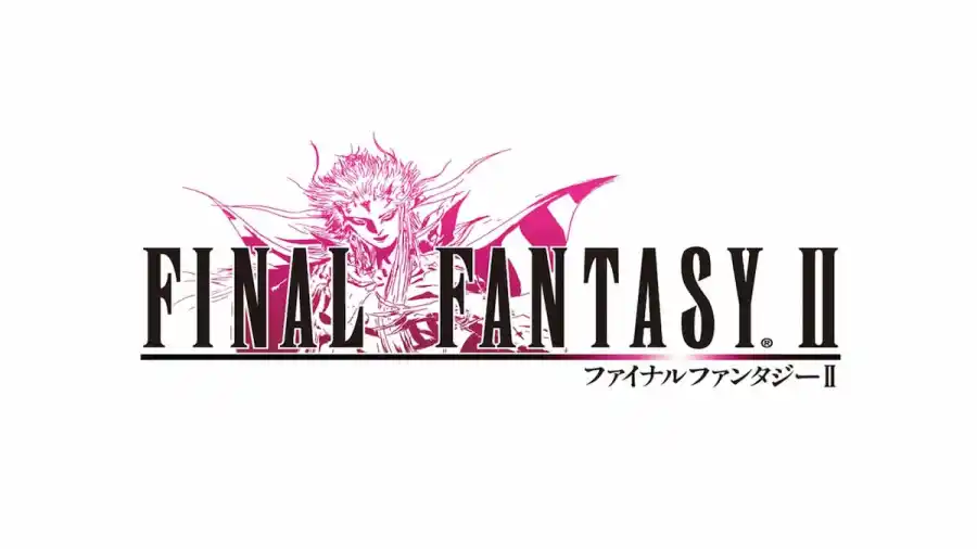
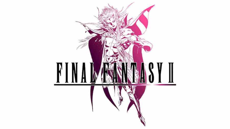
The first logo for the sequel game was a light dragon-like design with italic lettering and bright purple fading into a blue. The redesign by Amano for Origins centered around Emperor Matheus, the main antagonist of the game, in pink. The 20th-Anniversary version of the design was a full-body design of The Emperor and has been used ever since.
Final Fantasy III
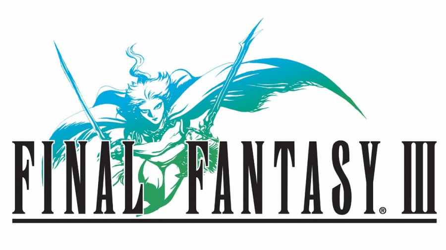
Like the previous title, FFIII's logo had the same dragon-like design but was gold with three columns in the background. Amano's redesign for the Nintendo DS re-release of the game features an unknown Warrior of Light in green and blue, wielding two swords.
Final Fantasy IV
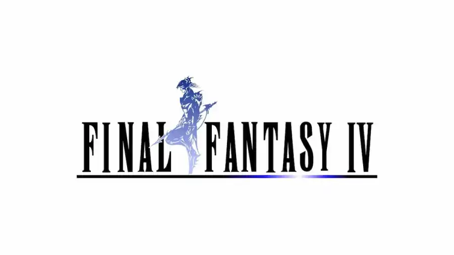
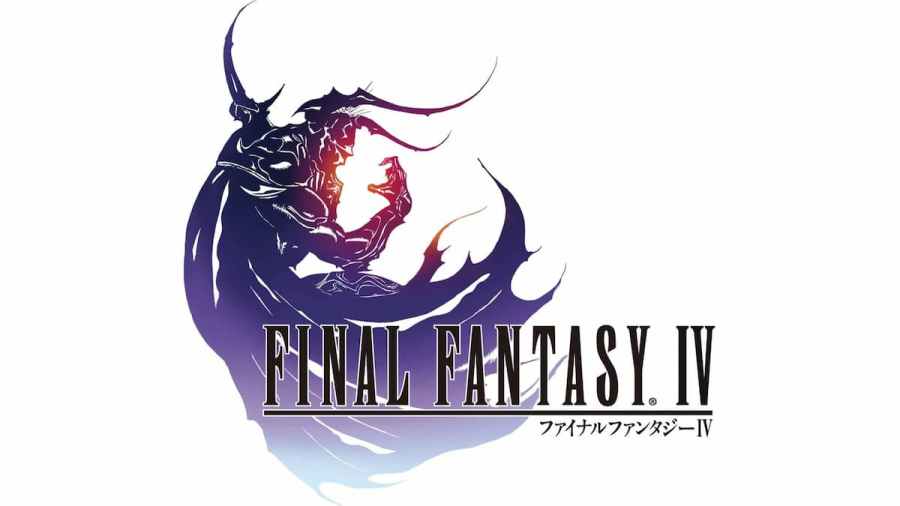
Kain Highwind, the Dragoon, is Amano's focus in the logo of the fourth game. He poses in the shape of the number four in Arabic numerals and was the first game that Amano worked on for the designs. The West's version of the game remained in the same style as the first Final Fantasy, as it was known as Final Fantasy II (the previous two games were not released outside of Japan). The Nintendo DS redesign features the Man in Black instead.
Final Fantasy IV -Interlude-
The logo for the game is just the standard Final Fantasy logo with "-Interlude-" written beneath it in cursive. It is perhaps the least remarkable Final Fantasy logo.
Final Fantasy IV: The After Years
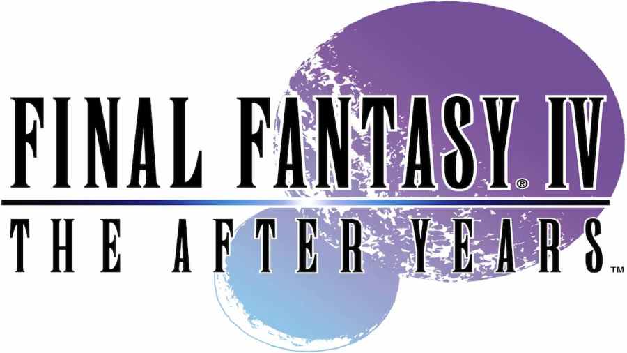
The logo for the game features the game's two moons with the new moon of the game being significantly larger than the other.
Final Fantasy V

The logo for this entry features a Wind Drake, the friendly dragon race that Dragoons are usually associated with.
Final Fantasy VI

The Western release of the game was titled Final Fantasy III and features a silhouette behind the logo. The logo for the game everywhere else, including for any re-releases, is Amano's illustration of Terra on top of a Magiteck Armor.
Final Fantasy VII
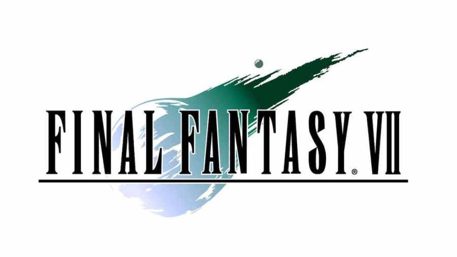
The original game's logo prominently features an illustration of the Meteor in the game, with the color carefully chosen to reflect the Lifestream and Mako energy.
Final Fantasy VII Remake
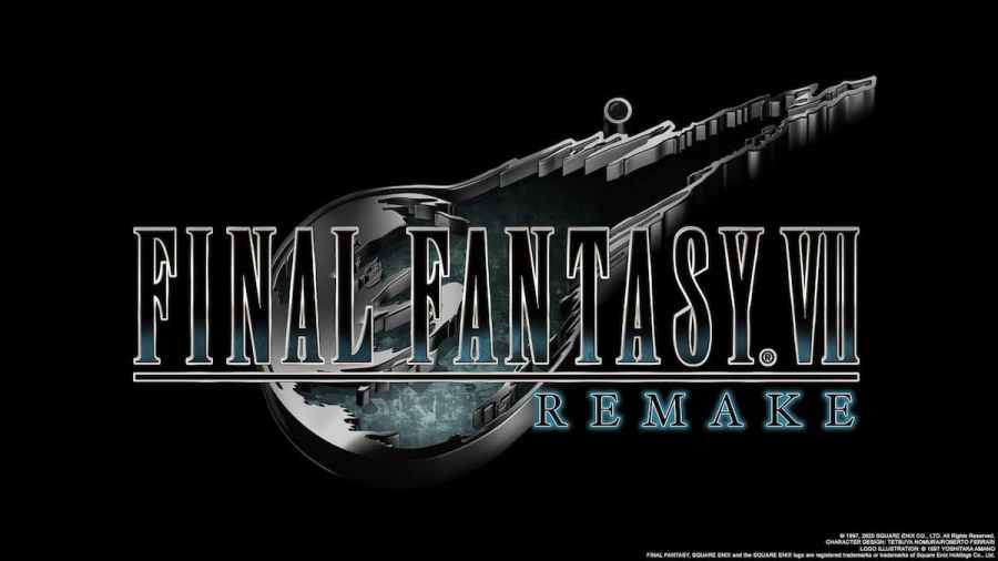
The logo is the same as the original but made more metallic and 3D in nature.
Before Crisis -Final Fantasy VII-
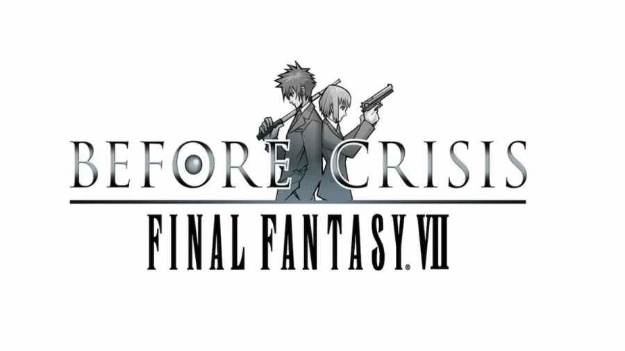
The logo is made up of the two playable characters for the mobile game with the logo's "O" made of what is thought to be Materia.
Crisis Core -Final Fantasy VII-
The logo simply has a blue sky with some clouds in the background.
Dirge of Cerberus -Final Fantasy VII-
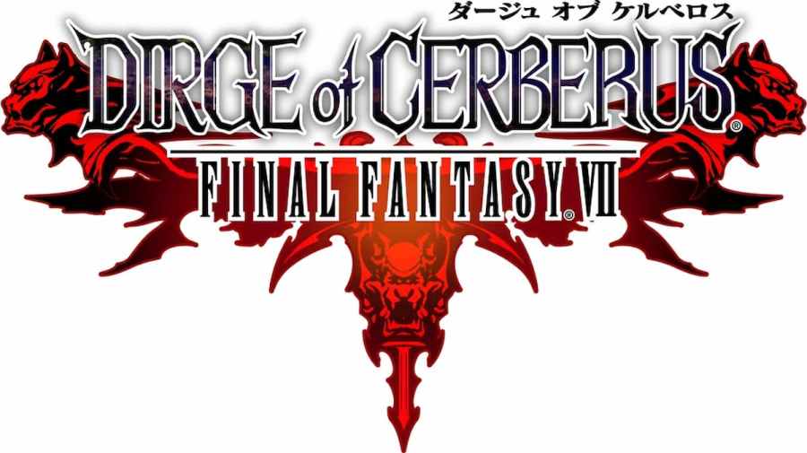
Using a different font than the usual Runic MT Condensed, there is a contrast between Dirge of Cerberus and Final Fantasy and a deep-red illustration of Cerberus thrusting out in three directions.
Final Fantasy VII The First Soldier
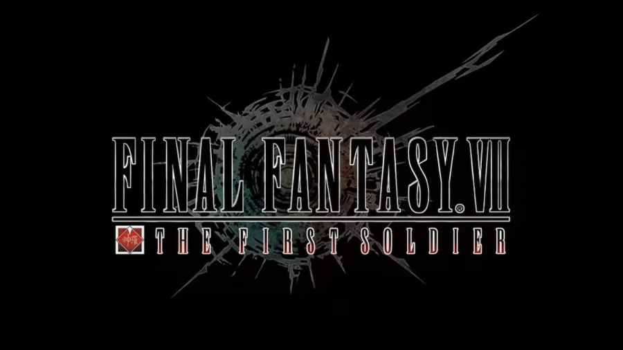
Using the same Meteor-like logo, Midgard's ruins are shown similarly to the Advent Children logo but with the Shinra company logo beside the game's subtitle.
Final Fantasy VII Ever Crisis
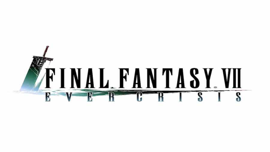
The Buster Sword is shown plunged into the ground to the left of the title. Part of the ground also underlines Final Fantasy VII.
Final Fantasy VIII
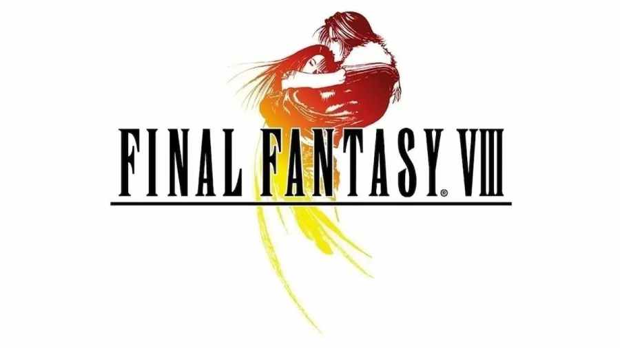
Squall and Rinoa are the subjects of the game's logo as it was specially requested of Amano. The pose can be seen during the opening cinematic or at the Sorceress Memorial in the game. The colors reflect the sunset in the background as Rinoa falls into Squall's arms.
Final Fantasy IX
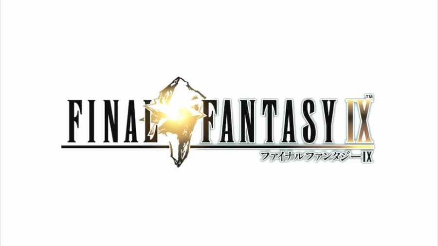
The illustration for Final Fantasy IX's logo depicts the Crystal from the game in a bright, golden color, echoed by the Roman Numerals' shade of gold.
Final Fantasy X
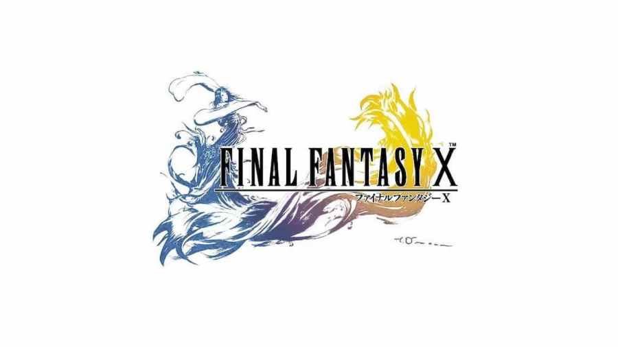
Yuna is shown performing a Sending using the same shades as when Pyreflies flock around the bodies of those who have passed. The scene is directly taken from Killika Port in the game.
Final Fantasy X-2
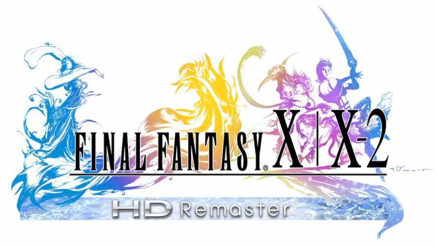
The illustration for the sequel uses a reverse gradient and applies the same color scheme as the first game. Yuna, Rikku, and Paine are the subjects of the illustration.
Final Fantasy XI
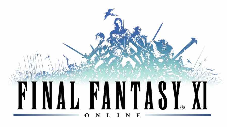
Five warriors, each of a different race, are depicted in the game's illustration. They are thought to be an army from the Crystal War. Each of the characters represents a playable race within the MMO.
Final Fantasy XII
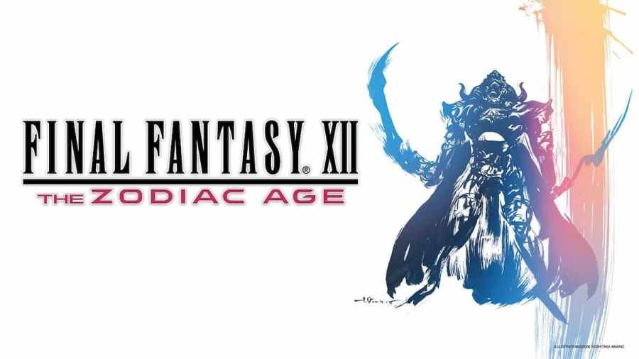
Judge Gabranth is the focus of the logo with a large, vibrant brushstroke on the right. The pose can be seen inside the game's Sky Fortress Bahamut.
Final Fantasy XII Internation Zodiac Job System
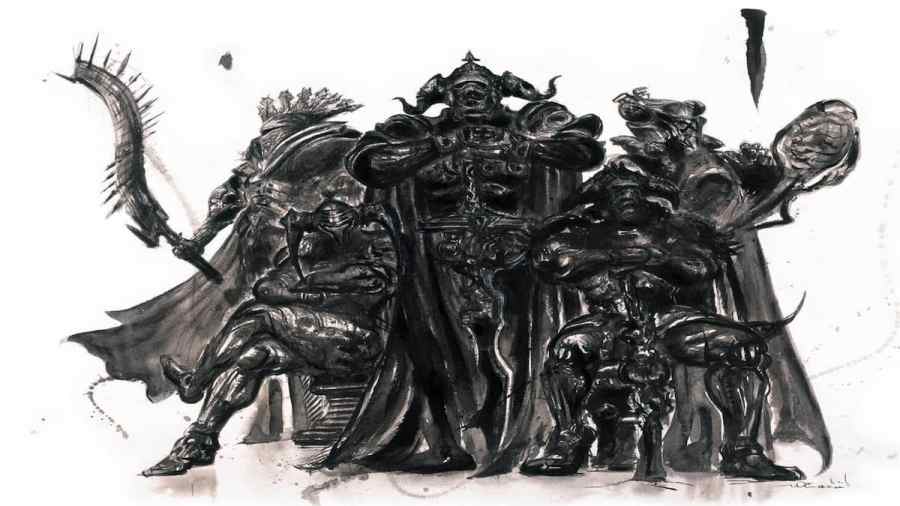
All five Judge Magisters are illustrated in a darkened, statue-esque pose for this title.
Final Fantasy XII: Revenant Wings
Designed by Isamu Kamikokuryo, the blue-green logo for the DS title is of the Galbana.
Final Fantasy XIII
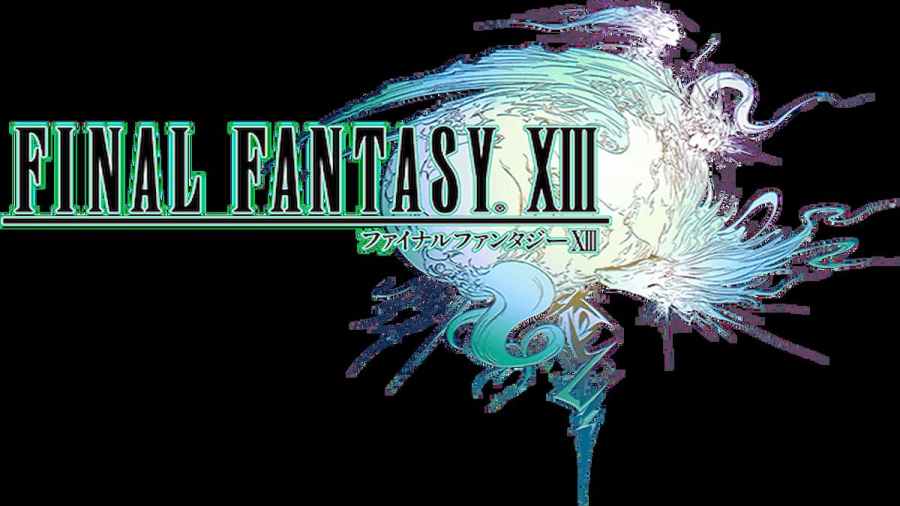
The logo features Cocoon being held up by Fang, Ragnarok, and Vanille as the pillar is replaced by the outline of Serah's pendant. This illustration is what influenced Cocoon's appearance in the game.
Related: How to Switch Worlds/Servers in Final Fantasy XIV
Final Fantasy XIII-2
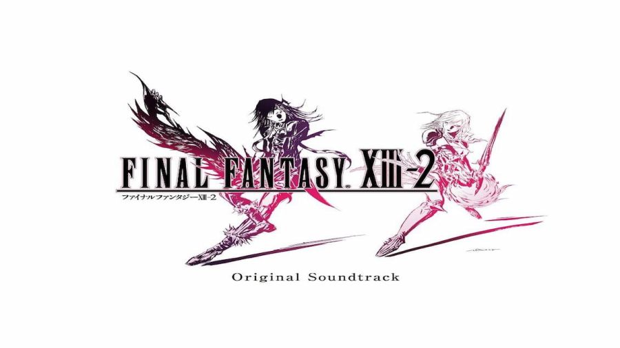
The logo shows pink-shaded Lightning posed beside Caius Ballad.
Lightning Returns: Final Fantasy XIII
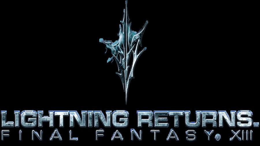
The logo replaces the usual typeface and Amano illustration with a Crystal that has lightning texture over it.
Final Fantasy XIV
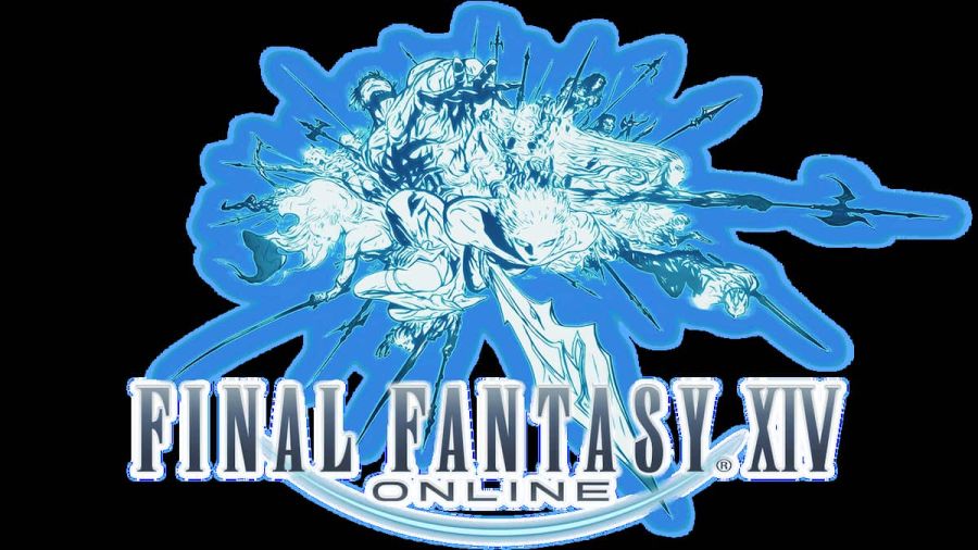
Several warriors with their weapons drawn make up the logo for Final Fantasy XIV. Note that a different color was used for when the game was relaunched. The "O" used is on fire to represent A Realm Reborn's meteor that would change the world for the relaunch.
Final Fantasy XIV: Heavensward
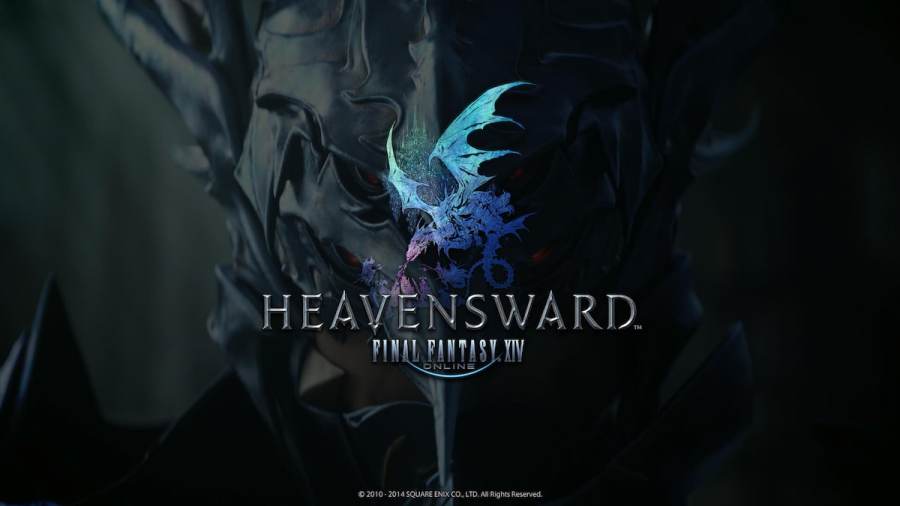
The logo for the expansion shows Ishgardian soldiers fighting a dragon (symbolizing the Dragonsong War) with the city of Ishgard in the background.
Final Fantasy XIV: Stormblood
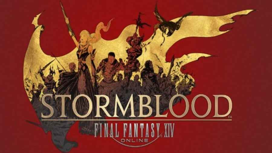
The background of the logo is a flag with the foreground being taken up by Lyse Hext, The Warrior of Light, Raubahn, and other revolutionaries leading the Ala Mhigan Revolution.
Final Fantasy XIV: Shadowbringers
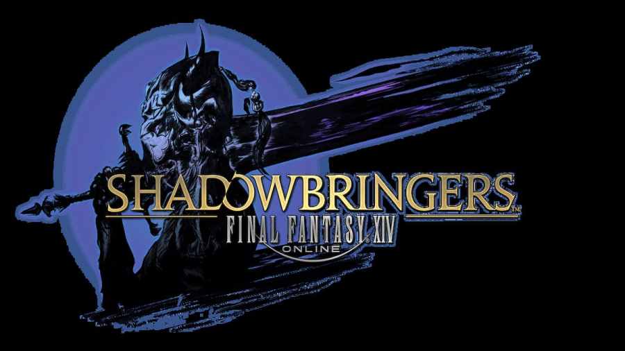
The logo is a side profile of a Dark Knight that symbolizes the change in the Warrior of Light.
Final Fantasy XIV: Endwalker
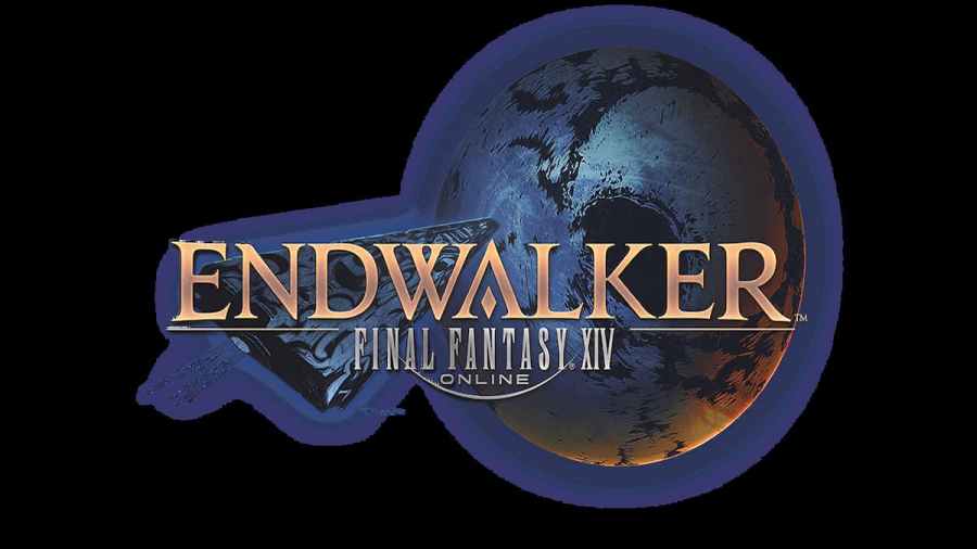
The logo displays a ship flying towards the Moon with light eminating over the horizon.
Final Fantasy XV
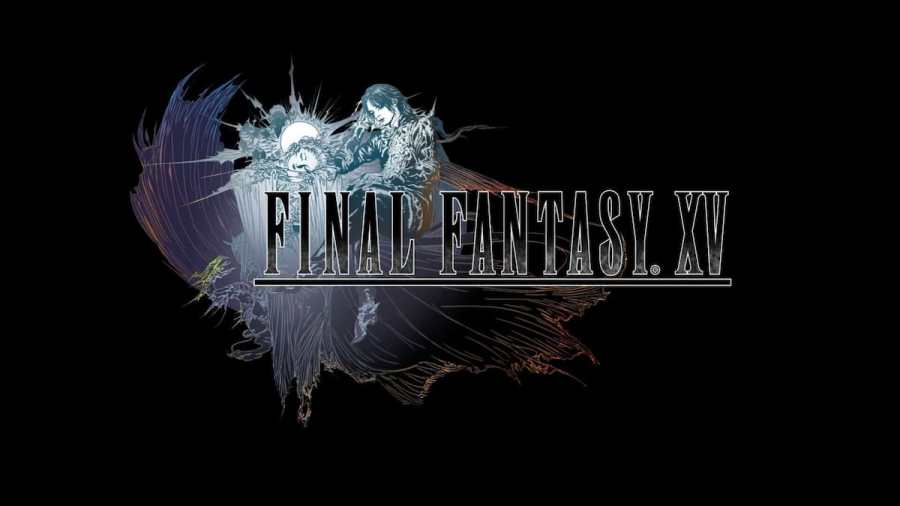
The logo is of a winged Oracle sleeping with her head over her arms. A crystal orb behind her represents the sun or the moon. The shape of the logo represents a closed eye and refers to the game's theme song "Somnus." Beating the game will add to the logo, showing Noctis sleeping beside her.
Final Fantasy XVI

The logo for the game features two summons, or Eikons, fighting each other. They are Phoenix and Ifrit.
And with that, those are all the mainline Final Fantasy game logos and their meanings. There are many other titles and spin-offs all with their own logos and meanings as well. Amano is a talented illustrator whose work has inspired direct changes within many of these titles. It's hard to imagine just what the series would look like (literally) without him.
For more guides on Final Fantasy XIV, check out How to Switch Worlds/Servers in Final Fantasy XIV on Pro Game Guides.
