Every so often the Roblox company updates the user experience across the entire platform. Some of these changes are massive, like the implementation of Display Names, while other changes are subtle. One such subtle change is the new cursor, which has a new appearance.
Roblox Cursor Update (2021)
The new Roblox cursor, seen below, is not a huge departure from the previous design. With the new update, the cursor received a tail, which falls more in line with the default Windows cursor that PC users are accustomed to using. The new cursor retains a black outline and the click version (shown bottom-right) retains the outline, as well.
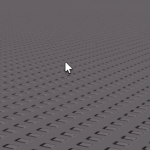
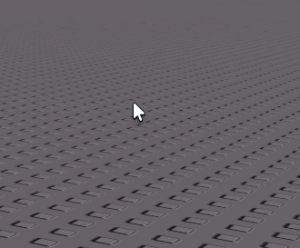
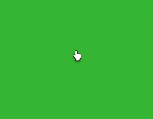
Evolution of the Roblox Cursor
The Roblox cursor received many redesigns throughout the years. The original cursor that launched with the game in 2005 was much more cartoony in appearance. This original cursor contained a long, long tail that isn't standard of most mouse cursors. But this original design lasted for nearly seven years on the platform.
According to SharkBlox, the 2005 cursor sometimes had a green circle hovering around the cursor, which must have been a design choice from the developer's discretion.
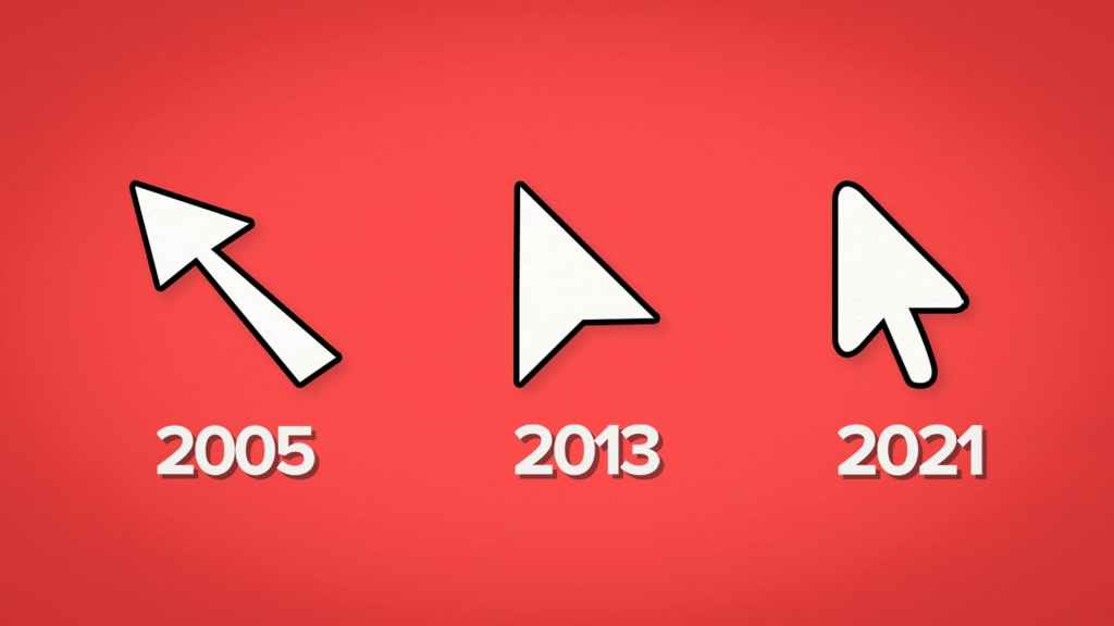
In 2013, however, the company opted to remove the tail entirely, instead giving the cursor a flat, paper plane-like appearance. Now, the tail has returned to the cursor in the newest 2021 design, albeit much shorter in fashion.
The Roblox mouse cursor is just one of dozens of updates frequently made to the platform. What do you think of the latest cursor design? Do you prefer it over the other iterations? Which cursor is your favorite?
For more Roblox guides, check out Best Roblox RPG Games and the The Best Roblox Obbies on Pro Game Guides.
