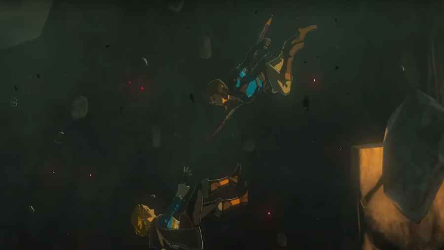
As a new Zelda game for the Nintendo Switch, Tears of the Kingdom will doubtlessly be compared graphically against its predecessor, Breath of the Wild. Of course, the two games are bound to look similar since they take place in the same setting. Having been so long after Breath of the Wild's release (2016), though, some fans are expecting a huge boost in graphics.
How will Zelda Tears of the Kingdom graphics compare to Breath of the Wild?
The bottom line is it's impossible to accurately compare the graphics of Breath of the Wild to Tears of the Kingdom until the game actually releases. This is because in game footage will always have a better resolution than footage found in a video of a trailer. That being said, the early indication is Tears of the Kindgom will be a step up from its prequel in terms of graphics.
Here is a picture of the Royal Throne Room of Hyrule Castle seen in the final trailer for Tears of the Kingdom.

Here is a picture of the same room as seen in the memory from The Champion's Ballad DLC for Breath of the Wild:

At first glance, it may seem like the picture from Breath of the Wild looks clearer. Look at the column where light falls in the Tears of the Kingdom picture, though; the elements of the column are very clearly defined, and the light leaves a very believable shadow.
This is only one example of an object being more clearly defined in the trailer from Tears of the Kingdom than it was in Breath of the Wild. Another example is Zelda's hair: in the trailers for Tears of the Kingdom, strands and patterns in Zelda's hair can be easily identified, while her hair in Breath of the Wild is much more bland.
It's possible textures on common landmarks will look the same in both games, while graphics for new characters, regions, and objects will impress the most. Either way, comparisons before the game actually releases will bear little fruit.
Want more Zelda guides? Pro Game Guides has you covered with Is Zelda dead in Zelda Tears of the Kingdom?
