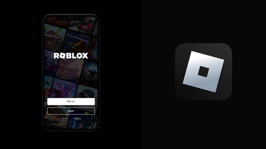
On Aug. 26, 2022, Roblox's CEO and Founder David Baszucki released an official statement on the Roblox blog site confirming what many players were hoping was just a rumor—that the site would be getting an update in branding that consists of a new logo, font, color scheme, and slogan. Though not much has changed between the updated branding and the previously used set, many fans have taken to Twitter to express their distaste with the new debut and even petition to bring the old branding back to the billion-dollar platform.
Since its original debut as a beta program in 2004, Roblox has gone through numerous refreshes, with its most famous change occurring between 2017 and 2018, when the company decided to leave its cartoon-ish red lettering behind and instead opt for the white and black block-style lettering that it's known for today.
Despite these previous refreshes, however, players in 2022 feel as though the most recent change to Roblox's font, which replaced the second, non-tilted Roblox cube in the platform's title with the letter O and gave the font itself a less-blocky look, is seemingly the worst, receiving an abundance of criticism for being "too corporate."
In reply to someone stating that the new logo is a better look for Roblox, Twitter user @DecentDevYT disagreed, saying, "It’s more 'corporate' than the last one! The last one was blocky and kinda fun, this one just has a boring corporate font." In another string of tweets, user @insomniainsect stated, "Older isn’t always better, but the fact that the old logo no longer fits Roblox just shows how far gone the game truly is. It’s a step in the right direction for their godawful modernized vision of Roblox and their beloved 'Metaverse' that’s for sure."
Alongside its new font, Roblox also unveiled a new slogan, changing its original "Powering Imagination" tagline to "Reimagining the way people come together," and a new, slightly-adjusted logo. This new logo, which looks nearly identical to the previous Roblox logo minus a now-widened hole, might be the most detrimental change that Roblox announced, with players accusing the platform of stealing the logo from popular game development company Bethesda.
Related: Crown Academy is cleared in federal court after nearly two years of battling theft claims
Fans of Roblox's classic look can also say goodbye to its iconic red, black, and white theme, as the platform has introduced a new array of colors to its brand portfolio: mindaro, neon purple, pattens blue, black pearl, bokara grey, and white. The unofficial, yet community-trusted, Roblox news account Bloxy News was one of the first accounts to show off these new colors on Twitter, debuting an updated logo for the account that uses all of Roblox's new branding.
Related: Is Kim Kardashian suing Roblox? | Everything you need to know about the Kardashian X Roblox feud
Though, as mentioned above, many users are currently against Roblox's rebrand, others have stood up in favor of the changes. When popular Roblox YouTuber KreekCraft took to Twitter to show his support for Roblox's announcement, waves of users sided with him, including @rThernus, who replied, "I love that tagline, and the logo change is something that I'm really indifferent about because it's practically the same. The new typeface is amazing, the new tagline is amazing, and the logo change is completely forgettable. I think the hate on this change is unjustified!" Another user, @diasstebanak, stated, "This [logo] is a lot more fun. It's less bold, which means it's easier to read, [and] it gives the 'Cheez-It' more recognition since the other O [in Roblox] is now just a usual O. Roblox is heading in a more positive direction as seen by their recent activity."
Whether Roblox fans agree with the design changes or not, the brand update is here to stay. It will be displayed across Roblox's website and social media in the coming weeks. Baszucki stated in his announcement that "the Roblox logo represents building, progression, and motion," none of which would be possible without making changes.
Interested in reading up on more Roblox news? Check out our recent articles on Annual Roblox Bloxy Awards revamped into Roblox Innovation Awards or Roblox’s famed “oof” sound has been removed from the platform due to licensing issues here on Pro Game Guides.
